I signed up as a real user, went through the entire flow, and documented everything I'd fix. My students are the target customer.
Arash Vakil · CPO & Growth Leader · 20 years in consumer products · Professor at CUNY
01. Where We Are
The Diagnosis
Before talking strategy, I signed up, went through the flow, and stress-tested the product.
Core Problem
Comprehension & Legitimacy Gap
Users land on the site and immediately ask: "Why am I paying to do an internship?" They hit the paywall and go to Reddit to check if it's a scam. The value prop isn't landing before the payment wall.
Churn Pattern
"Mission Accomplished" Drop-off
Users complete one externship, update their resume, and cancel. They came for a transaction (one credential), not a relationship. The product doesn't give them a reason to stay.
02. Product Audit Findings
I Found Revenue Leaks in the Current Flow
I went through the signup and payment experience myself. Here's what I found before writing a single line of strategy.
⚠️
Payment Page Reset Bug
The payment page at app.extern.com/payment resets unexpectedly during the checkout flow. For a product with a top-of-funnel trust problem, any friction at the payment step is catastrophic. Users who are already skeptical will interpret a glitchy checkout as confirmation that this isn't legit. This is likely costing conversions right now.
Pricing is hidden until you're deep in the signup flow. For a product fighting legitimacy concerns, hiding the price feels like a bait-and-switch. Transparent pricing builds trust.
Observation
Pricing Simplicity vs. Revenue
Current tiers are $10/mo and $99/yr. There's no quarterly option and no premium tier for career coaching. Students who want more than one externship but won't commit to 12 months have nowhere to go. Money is being left on the table.
Day 1 Quick Win
Fix the payment page reset bug. Ship a visible pricing page on the marketing site. These are zero-strategy, high-impact fixes that recover revenue immediately while we work on the bigger plays.
03. The Leaky Funnel
Where Users Drop Off
The funnel has two critical drop zones. Fix these and the math changes fast.
Stage
Action
Drop-off Reason
Awareness
Land on extern.com
Interest
Browse externships
Significant bounce
Consideration
Hit paywall
Legitimacy wall: "Is this a scam?"
Conversion
Start trial
Payment page resets / friction
Activation
Complete first externship
Very few make it here
Drop Zone 1: Pre-Paywall
Why they leave: "Why would I pay for an internship?" The concept of an externship needs to be reframed before the price appears. They need to see outcomes (jobs landed, companies impressed) not features (access to externships).
Drop Zone 2: After the First Externship
Why they leave: They got what they came for: one resume line item. The product hasn't shown them the next reason to stay. Students think in semesters, not subscriptions. Once the goal is met, there's no career progression path, no cohort bonds, no "what's next" moment.
04. Days 1-30: Legitimacy & Comprehension
Kill the "Is This a Scam?" Question Before It's Asked
Strategy 1: Outcome-First Positioning
Lead with Jobs, Not Externships
Redesign the landing page to lead with job outcomes: "Morgan Stanley. HSBC. Amazon. Our externs work there now."
You already have incredible testimonials (Lazard, Boeing, Capital One alumni). These are buried in a carousel. They should be the first thing a visitor sees.
Add a real-time counter: "X externs hired this month." A social proof counter that updates dynamically
I teach these students at CUNY. I know exactly what they're skeptical about and what makes them pull out their credit card: proof that someone like them got a real job from this.
Strategy 2: Legitimacy Signals
Brand Armor at Every Touchpoint
Company logos above the fold: Amazon, Pfizer, Epic Games, Snap, News Corp. These are trust accelerators. Use them aggressively.
LinkedIn verification loop: when externs complete a program, auto-generate a shareable credential. Every LinkedIn post becomes a free ad and legitimacy signal.
"Extern vs. Traditional Internship" comparison page: address the "why pay?" objection head-on with a clear, honest breakdown.
Reddit/SEO play: create content for "Is Extern legit?" searches. Own the narrative instead of letting anonymous posters control it.
The CUNY Advantage
I'm not guessing at this persona. I teach about 50 students per semester who are Extern's exact target customer: undergrad and grad students at a large public university, many first-gen, all hungry for resume-building experience. I've heard the objections firsthand: "Why would I pay for experience when I should be getting paid?" The answer that works isn't about features. It's about showing them someone who looked like them, who did an externship, and is now at Goldman or Amazon.
The Australia Lesson: Controlled Rollouts Save You
At a previous company, I ran a controlled rollout of a major product change to the Australian market first. We caught a 25% engagement drop before it went global, diagnosed the issue, fixed it, and the global launch succeeded. Every change to Extern's landing page, pricing, and onboarding should follow this pattern: A/B test, measure, iterate, then roll out. No big-bang launches.
05. The Week 1 "Aha!" Redesign
Make Them Feel the Value Before the Trial Ends
The current "aha" comes too late, after completing an entire 6-8 week externship. We need to compress time-to-value into the first 7 days.
Day 1
Instant Match & Cohort
On signup, immediately match the user to an externship that fits their stated career interest. Assign them to a small cohort (5-8 people). Solo experiences are easy to quit. A cohort creates social pressure and accountability from hour one.
Day 3
First Deliverable Win
Design a micro-deliverable in every externship that can be completed in the first 72 hours. Something tangible they can screenshot and share. At a previous company with 50M+ DAUs, we found that users who created anything in the first 3 days retained at 3x the rate of passive users.
Day 5-7
"Resume Moment"
Before the trial ends, show them exactly how this externship will appear on their resume. Auto-generate a resume bullet point with the company name, skill, and deliverable. Make the value tangible and visual: "This is what you're paying $10/mo to keep building."
The Duolingo Parallel
Duolingo works because it turns tiny wins into momentum with streaks, XP, progress bars, and a clear next step every time you log in. Extern should borrow that same gamification layer. The milestone structure already exists; we just need to break Week 1 into smaller checkpoints, make progress visible, and reward early completion so students feel traction before the paywall hits.
06. Solving Early Churn
From "Mission Accomplished" to Career Acceleration
Students who complete one externship and leave aren't failing. They're telling you something: the product gave them what they came for, but never showed them what's next. With no reason to stay and a student mindset that thinks in semesters, early churn is inevitable unless you change the model.
Current State
The Transaction Trap
User signs up → completes 1 externship → puts it on resume → cancels. The product is positioned as a one-time purchase disguised as a subscription. Of course they churn. The job is done.
Target State
The Career Portfolio
User signs up → completes externship 1 → sees their "career portfolio" growing → gets matched to externship 2 in a different skill area → builds a multi-dimensional profile → stays because the portfolio compounds in value over time.
Intervention 1: Portfolio & Progress
Build a persistent "Career Portfolio" dashboard showing all completed externships, skills earned, and companies worked with
Show a progress bar: "You've explored 1 of 6 career domains"
After completing externship 1, auto-recommend externship 2 with a compelling reason: "Externs who added Data Analytics after Marketing were 2x more likely to land interviews"
Intervention 2: Cohort Stickiness
Small cohort = social bonds. Don't disband cohorts after the externship ends.
Create an alumni channel per cohort. It's light-touch community management that costs almost nothing to maintain.
Peer accountability: "3 of your cohort members are starting a new externship this month"
This is how Peloton and Duolingo retain: identity and community, not just content
Fire a personalized retention sequence at that exact moment, not a generic "don't go" email
"You just completed Marketing with Beats by Dre. Externs who add a Finance externship next get 40% more interview callbacks."
07. Pricing Restructure
The Current Pricing Leaves Money on the Table
Current Tiers
Too Simple, Binary Choice
Basic: $10/month (after 7-day trial)
Premium Bundle: $99/year (~$8.25/mo)
Problem: No middle ground. Students either commit monthly (and churn early) or go annual (high friction for a skeptical user). No tier for the student who wants one quarter of access.
Proposed Tiers
Aligned to Student Behavior
Monthly: $15-20/month. Anchors higher and captures the full externship cycle value
Quarterly: $39/quarter (~$13/mo). Maps to one academic semester and fits the "I'll try one externship" mindset
Annual: $99/year (~$8.25/mo). Same price, still a strong value anchor for committed users
Premium: $199/year. Adds 1:1 coaching, priority matching, and exclusive company programs
Why This Works
The quarterly plan is the key unlock. Students think in semesters, not months. A $39 commitment for "one semester of career building" is psychologically easier than $10/mo recurring (which feels like a subscription they'll forget to cancel). It also extends the average lifetime past the early churn cliff. If they paid for a quarter, they'll use the full quarter, and by then they have enough portfolio value to convert to annual.
If the LTV math supports it, I'd also test a one-time lifetime access plan for students who hate subscriptions but are willing to make a bigger upfront commitment.
07B. Pricing Experiments
8 Experiments to Run on the Pricing Experience
Extern has no public pricing page, hides cost until deep in the funnel, and shows zero price context on externship cards. Each idea below includes a testable mockup.
Experiment 1
Create a Dedicated Pricing Page
Students researching Extern cannot easily find basic pricing info before they enter the checkout flow. A transparent pricing page with clear plan comparison, trial details, and value framing builds trust and captures high-intent traffic.
A/B test: Measure sign-up conversion for visitors who see the pricing page vs. those who go through the current hidden-price flow.
Hypothesis: Transparent pricing increases qualified sign-ups by 15-25% and reduces post-payment churn.
Pricing
Invest in Your Career
Less than a textbook. Real-world experience.
Monthly
$15
/month
7-day free trial
Popular
Quarterly
$39
~$13/mo
Save 13%
Annual
$99
~$8.25/mo
Save 45%
vs. $5,000+ bootcamps · vs. unpaid internships · 75% of externs find a job outcome
Experiment 2
Show Price on Externship Catalog Cards
Externship cards show duration and skills but zero price context. Students browse not knowing if they can afford it, creating anxiety and bounce.
A/B test: Cards with "Free trial, then $X/mo" badge vs. current no-price cards. Measure click-through + "Start Externship" rate.
Hypothesis: Price transparency on cards increases qualified clicks by filtering early and reassuring interested users.
BEATS
MarketingData Analytics
FREE TRIAL · then $15/mo
Beats by Dre Consumer Behavior & Market Analysis
Duration
8 Weeks
Starts
Mar 16
▲ New: price badge on card (currently absent)
Experiment 3
Add Price Context to "Start Externship" CTA
The detail page button says "Start Externship" with no price. Users click blind, not knowing if they'll hit a paywall or what the trial includes.
A/B test: "Start Externship" (current) vs. "Start Free Trial, then $15/mo" vs. "Start Free 7-Day Trial." Measure click-through and trial-to-paid conversion.
Hypothesis: Users who click knowing the price convert to paid at a higher rate.
Current (no price)
Start Externship
You can switch programs anytime
Variant A
Start Free 7-Day Trial
Then $15/mo · Cancel anytime
Variant B
Start Free Trial
7 days free · No credit card required
Experiment 4
Value Framing: ROI Section on /student & /gift
The student page has strong testimonials but never pairs them with price. Add a "What it costs" section that anchors price against ROI and alternatives.
Hypothesis: Framing $15/mo against $5K bootcamps and $0 unpaid internships makes the price a no-brainer.
What It Costs vs. What You Get
Bootcamp
$5K+
3-6 months
Unpaid Intern
$0
But no flexibility
Extern
$15
/mo, flex, remote
75% of externs find a job outcome · ROI of 300x+
Experiment 5
Gift Page: Show Clear Pricing Tiers
The /gift page is the highest purchase-intent page on the site. Visitors came specifically to buy. Yet it shows zero pricing.
A/B test: Current gift page (no price) vs. gift page with clear tier cards. Measure gift purchase conversion.
Hypothesis: Adding visible gift tiers will increase gift purchases by 30%+.
Gift Plans
Give someone the career boost they deserve
Starter
$39
1 Quarter 1 Externship
Gift This
Best Value
Annual
$99
Full Year Unlimited
Gift This
Premium
$199
Year + Coaching Priority Match
Gift This
Experiment 6
Add Actual Price to FAQ Answers
The FAQ says "7-day free trial" but never says what it costs after. Students read the FAQ specifically to find pricing and leave frustrated.
A/B test: FAQ with vague "subscription" language vs. FAQ with "$15/mo after free trial." Measure bounce rate and sign-up clicks.
Hypothesis: Stating the price reduces bounce and increases sign-ups from price-conscious visitors.
Current FAQ
Is there a free trial period?
Yes, Extern offers a 7-day free trial, so you can explore the platform and externship options before committing.
Proposed FAQ
How much does Extern cost?
Start with a free 7-day trial. Then $15/mo (or save with quarterly at $39 or annual at $99). Less than a textbook for real-world experience.
Start Free Trial →
Experiment 7
Social Proof + Price Pairing on Testimonials
Incredible testimonials (Goldman Sachs, Morgan Stanley, Amazon) are disconnected from any CTA or price. Pair each outcome with the price to create an irresistible value equation.
A/B test: Testimonial carousel (current) vs. testimonials with inline price CTA. Measure click-through from testimonials to sign-up.
Hypothesis: "Bintou landed Goldman Sachs. Start for $15/mo" converts better than testimonials alone.
BD
"Less than two months after my externship, I landed Goldman Sachs."
Bintou Majula Drammeh
Summer Analyst at Goldman Sachs
Start Your Externship: $15/mo after free trial
▲ Each testimonial becomes a conversion unit
Experiment 8
Urgency & Scarcity Signals on Catalog Cards
Cards show start dates but no cohort capacity or enrollment velocity. Adding "X spots remaining" creates urgency without being manipulative (if based on real data).
A/B test: Current cards vs. cards with "X of 30 spots filled" progress bar. Measure "Start Externship" click rate.
Hypothesis: Students who see limited spots start immediately rather than bookmark and forget.
NEWS CORP
Product Management at News Corp
Starts
Mar 23
Duration
8 Weeks
Referral Opportunity
22 of 30 spots filled8 left
▲ Scarcity bar drives urgency with real enrollment data
Zero-Dev Quick Wins (Ship This Week)
Publish a clear public pricing page and link it from key marketing surfaces.
Add "Free 7-day trial" badge to catalog cards.
Add actual price ($15/mo) to FAQ answers.
Add visible gift pricing tiers to /gift.
Add "then $X/mo" subtext under every "Start Externship" button.
08. 180-Day Execution Plan
The Roadmap
Days 1-14: Triage
Fix payment page bug. Instrument the funnel in Mixpanel/Amplitude. Audit every step from landing to first payment. Ship a public pricing page. Meet with eng team 1:1s to build trust and understand velocity.
Days 15-30: Quick Wins
Redesign above-the-fold with outcome-first messaging. Add company logos and alumni outcomes prominently. Launch "Is Extern legit?" SEO content. A/B test new landing page vs. current. Design Week 1 micro-milestones.
Days 31-60: Aha + Pricing
Ship the compressed Week 1 "aha" experience with micro-deliverables. Launch new pricing tiers (quarterly plan). Build the Career Portfolio dashboard. Set up cohort infrastructure. First experiment results from landing page A/B test.
Days 61-180: Growth Loops
Launch LinkedIn credential sharing (PLG flywheel). Activate pre-churn intervention system. Build referral loop: "Invite a friend, get 2x company visibility." First cohort retention data. Iterate on pricing based on conversion data.
KPI: Activation
Trial → Paid Conversion
Baseline → +30% within 90 days. Measured by: % of trial users who convert to paid within 14 days of signup.
KPI: Retention
Early Churn Rate
Significant reduction within 180 days. Measured by: % of paid users who cancel in their first few months. Targeted by cohorts, portfolio progression, and semester-aligned pricing.
KPI: Revenue
ARPU Lift
Increase average revenue per user through quarterly plan adoption and monthly price increase. Target: +25% ARPU within 180 days.
09. Ideas to Explore
Bigger Bets Worth Investigating
Beyond the 120-day plan, here are strategic ideas I'd want to validate with data. These could be game-changers depending on what the numbers tell us.
Win/Loss Analysis
Understand Why We Win and Why We Lose
Before optimizing anything, we need to systematically understand: when someone converts, what was the deciding moment? When someone churns, what was the real reason? Not a survey, an actual structured win/loss analysis.
Win interviews: Talk to recent converts within 48 hours of payment. What tipped them over? Was it a testimonial, a specific externship, a friend's recommendation?
Loss interviews: Talk to churned users within a week of cancellation. Was it "mission accomplished," price, or something else entirely?
Pattern recognition: Map wins and losses to acquisition channel, externship type, cohort size, and time-to-first-milestone. Find the segments where we win big and double down.
At a previous company, this kind of analysis revealed that our assumptions about why users left were completely wrong. We were optimizing for the wrong thing
Lifetime Access Model
What If We Kill the Subscription?
The "pay monthly to do internships" framing is part of the legitimacy problem. Students are already skeptical. A recurring charge makes it feel like a trap. Depending on what LTV data tells us, a one-time lifetime access model could be transformative.
The math: If average LTV is ~$50-80 (3-8 months at $10), a one-time $149-199 "Career Launchpad" could capture more revenue upfront while eliminating churn anxiety entirely
The psychology: "Pay once, build your career" is a fundamentally different pitch than "$10/mo subscription." It reframes Extern from a recurring cost to an investment in yourself
The precedent: Masterclass shifted between subscription and lifetime passes. Codecademy offers lifetime plans. For career-building products, "lifetime" signals belief in long-term value
The hedge: Offer it alongside monthly/quarterly as a premium option. Let the data decide which model wins
Gift & Sponsorship Model
"Gift an Externship"
Parents and career counselors are an untapped acquisition channel. A "Gift Extern" flow (which already exists in the nav!) could be a major revenue driver if positioned around graduation season, back-to-school, and career fairs. This turns non-users into paying customers.
University Partnerships as PLG
B2B2C Through Career Centers
Instead of pure D2C, partner with university career centers to subsidize or co-brand externships for their students. The university pays, the student gets free access, and Extern gets distribution + legitimacy in one move. This is the B2B revenue engine powering D2C growth.
Employer-Funded Tier
Companies Pay for Talent Pipeline
Amazon, Pfizer, and Snap already run externships on the platform. Offer a "Talent Pipeline" tier where companies pay for priority access to top-performing externs. The student gets free access, the company gets pre-vetted talent. Revenue shifts from students to employers.
09b. Conversion & Retention Playbook
Tactical Ideas to Convert More & Keep More
Specific, implementable tactics to attack both sides of the growth equation: getting users to pay, and giving them reasons to stay.
Conversion: Getting to "Yes"
Free Sprint as Lead Magnet
Let Them Finish Something Before Asking for Money
Make the first Sprint (3-week, 3-5 hrs/week) completely free, no credit card required. Students complete a real deliverable, get a taste of the "resume moment," and hit the paywall only after they've experienced value. This flips the current model: instead of "pay to try," it's "try, prove it works, then pay for more." Codecademy, Duolingo, and every successful freemium product gates depth, not access.
Exit-Intent Rescue on Pricing Page
Catch Them Before They Bounce
When a user moves to leave the pricing/payment page, trigger an exit-intent modal: "Not ready? Start a free Sprint first" or "Talk to a current extern before you decide." For users who've already entered payment info but abandoned, fire a 3-email sequence within 48 hours: testimonial from a similar student → reminder of the externship they were about to start → limited-time quarterly offer.
Social Proof Triggers
Real-Time FOMO That's Actually Real
Add live activity notifications: "12 students joined the Amazon externship today" and "Sarah from NYU just completed her Pfizer project." Show cohort fill rates: "4 of 8 spots filled" on externship cards. This isn't fake urgency. Cohorts actually have limited sizes. Use real data to create authentic scarcity.
Parent & Gift Landing Page
The People With the Credit Cards
Build a dedicated parent-facing landing page reframing Extern as a career investment: "Your child will work with Fortune 500 companies for less than the cost of a textbook." Parents are the hidden decision-makers for college-age users. A "Gift Extern" CTA already exists in the nav. Build the funnel behind it and promote it during graduation, back-to-school, and holiday seasons.
Comparison & SEO Pages
Win the "Is It Worth It?" Search
Create targeted landing pages: "Extern vs. Unpaid Internship,""Extern vs. LinkedIn Learning,""Extern vs. Coursera." Students Google these comparisons. Own the results. Each page should end with a free Sprint CTA. Let the product sell itself. Also create "Extern reviews" and "Is Extern legit?" pages that rank above Reddit threads.
Student Ambassador Program
Turn Your Best Users Into Recruiters
Identify students who completed 2+ externships and are active on LinkedIn. Offer them free access + a commission for every referral that converts. Give them a unique landing page, a title ("Extern Campus Ambassador"), and content to share. Peer recommendations convert at 4-5x the rate of ads for this demographic. Each ambassador becomes a legitimacy signal on their campus.
Trial Extension as a Hook
Reward Engagement, Not Just Time
Instead of a flat 7-day trial, offer milestone-based trial extensions: complete your profile → +2 days. Start your first module → +3 days. Submit your first deliverable → +3 days. This gamifies the trial period and ensures users who are engaging get more time to hit the "aha moment." Users who don't engage weren't going to convert anyway.
Retention: Making Them Stay
Career Paths, Not Isolated Externships
Show Them the Bigger Picture
Create curated multi-externship sequences: "Product Management Path" (Marketing → Data Analytics → Product Strategy), "Finance Path" (Accounting → Investment Banking → Financial Modeling). When a student finishes one externship, the next step is already mapped out. This transforms Extern from "one and done" to a career development journey, and gives students a reason to stay subscribed for 6-12 months instead of 3.
Hiring Partner Access (Subscriber-Only)
Gate the Best Feature Behind Active Subscription
Create a "Talent Showcase" visible only to active subscribers: a job/internship board where hiring partners from externship companies post real opportunities. Students who complete an externship get flagged to that company's recruiters. Cancel your subscription → lose access to the hiring pipeline. This is the retention moat: the longer you stay, the more visible you are to employers. This alone could dramatically reduce early churn.
Streak & Milestone Gamification
Daily Engagement Loops
Implement a lightweight streak system: log in daily, review a module, give peer feedback → maintain your streak. Streaks unlock badges, priority cohort placement, and "Top Extern" status visible on their profile. Duolingo proved that streaks drive daily habit formation. A "15-day streak" notification is a powerful re-engagement tool that costs nothing to build.
Monthly Career Insights Report
"Here's What You Built This Month"
Send a personalized monthly email: skills added, companies worked with, peer ranking, portfolio growth. Include "what's new this month": new externships, new company partners, upcoming live sessions. This email serves two purposes: it reminds inactive users of the value they're losing, and it shows active users how their portfolio is compounding. Make progress visible and cancellation feel like loss.
Mentor Office Hours
Exclusive Access = Retention Moat
Offer monthly live Q&A sessions with mentors from partner companies, exclusive to active subscribers. "This month: 30 minutes with a Product Manager from Amazon." These sessions cost almost nothing (mentors volunteer for employer branding) but create ongoing value that can't be replicated by completing one externship and leaving. The subscription isn't just for externships. It's for access to a career network.
Win-Back Flow for Churned Users
The "Come Back" Sequence That Actually Works
30 days after cancellation, send a targeted win-back: "Since you left, 3 new externships launched in [their career interest]. Your cohort peers are now at [milestone]." Offer a discounted quarterly plan to re-subscribe. At 90 days, send a "career checkpoint": "You completed [externship] 3 months ago. Students who added a second externship were 2x more likely to get interviews. Come back for $29/quarter."
Annual Plan Nudges at Key Moments
Convert Monthly to Annual at Peak Value
Identify the "peak value" moment, right after completing an externship, earning an award, or getting peer recognition, and surface an annual plan offer: "You just completed your first externship. Lock in your next 3 for $99/year (save 40%)." Don't show this on Day 1 when they're skeptical. Show it at the moment they feel the most value. Timing is everything.
Highest-Impact Moves (Prioritized)
Free Sprint lead magnet. Removes the #1 conversion barrier.
Hiring partner access gated to active subs. Strongest retention moat.
Career Paths (multi-externship sequences). Turns a one-off purchase into a journey.
Student ambassador program. Peer trust beats any ad.
Monthly career insights email. Makes progress visible.
Exit-intent rescue on pricing page. Recovers abandoning users.
Parent landing page. Opens up a new buyer persona.
Win-back flow at 30/90 days. Recovers churned revenue.
10. App Experience Audit
I Walked Through the Product. Here's What I'd Fix.
I signed up and explored every page of app.extern.com. These are the UX issues and opportunities I found.
Critical: Empty Home Page
Home Is a Dead End
After signing up, app.extern.com/home shows "No active programs yet" with a single "Browse catalog" button. This is the single biggest missed opportunity in the product. This page should be a personalized dashboard: recommended externships based on career interests, a progress tracker, upcoming live sessions, and success stories from similar students. Right now it communicates "there's nothing here for you."
Critical: "Welcome" + "Trial Ending" at the Same Time
Onboarding Emails Destroy Trust Immediately
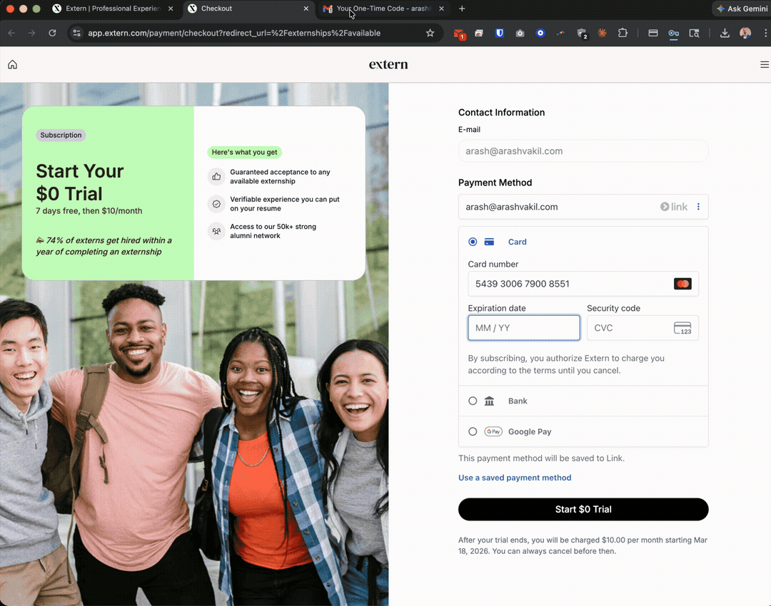
I signed up and received two emails in the same minute: "Welcome to Extern! Your Free Trial Has Been Activated" and "Your Extern trial ends soon." This is the first communication a new user gets. Instead of excitement and momentum, the very first touchpoint creates anxiety and signals desperation. This alone could be killing trial-to-paid conversion. The "trial ending" email should fire on Day 5, not Day 0. Day 1 should be pure onboarding: "Here's your first externship match, here's what you'll build this week."
Actual inbox: both emails arrived at 3:59 PM on sign-up day
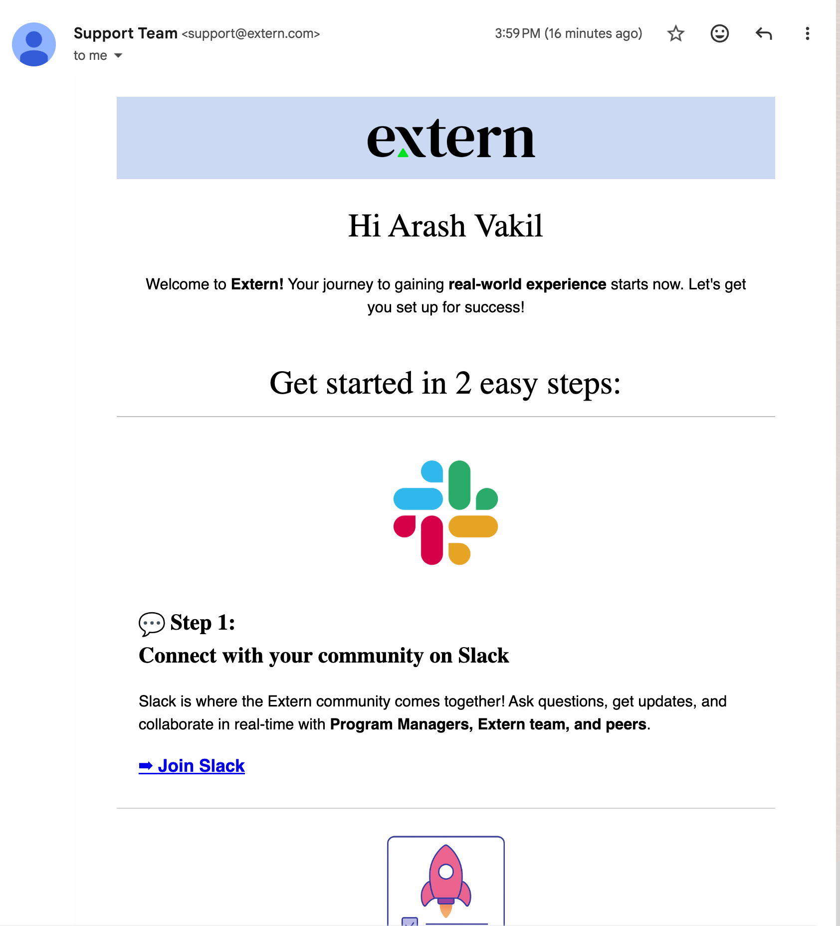
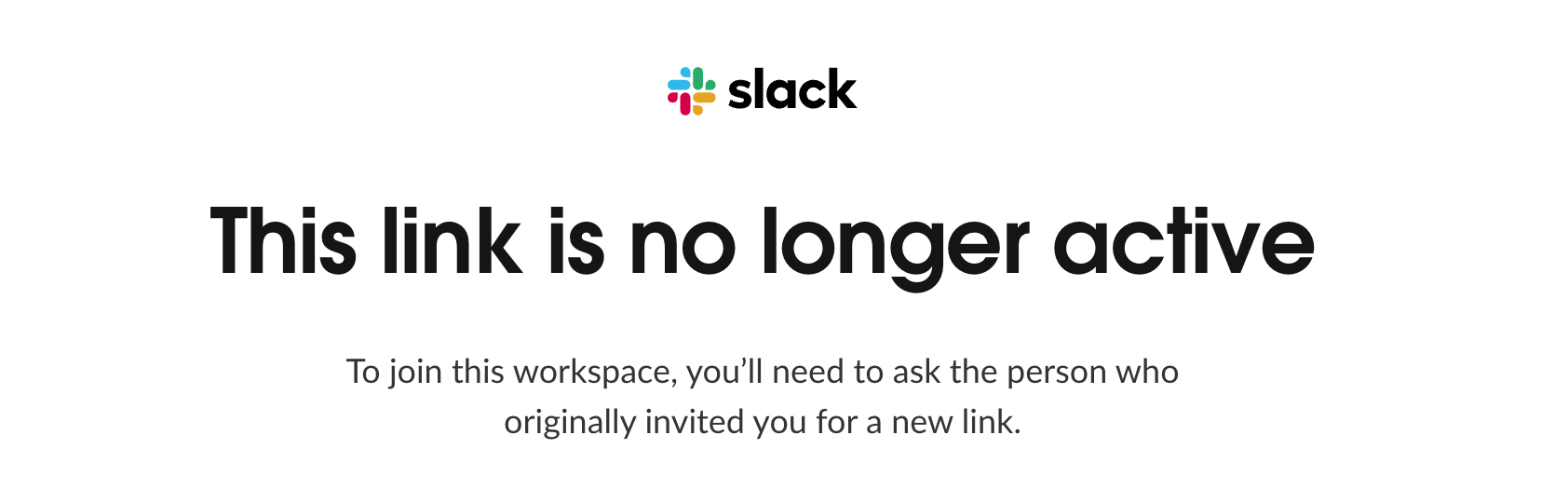
Critical: Placeholder Text After Signup
Generic Templates Undermine Credibility
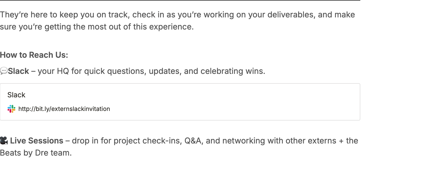
The broken Slack invite link is systemic across multiple touchpoints. The very first email a new user receives, the "Welcome to Extern" email, makes "Join Slack" Step 1 of onboarding. Clicking it leads to Slack's "This link is no longer active" error page. The same dead link appears again after enrollment, alongside a hardcoded "Beats by Dre team" reference that has nothing to do with the student's actual externship. The primary call-to-action in the first email a user ever receives is completely broken. When a platform tells you to "connect with your community" and the link is dead, it signals abandonment, not the real-world experience they're promising. Every user-facing touchpoint should reference the student's actual program, mentor, and cohort, and all Slack invite links should be validated or routed through a permanent redirect.
Welcome email makes "Join Slack" the very first action, and the link is deadClicking "Join Slack" leads to Slack's "This link is no longer active" errorPost-enrollment view shows the same broken Slack link plus a hardcoded "Beats by Dre team" reference
Filter Overload on Catalog
40+ Filters, No Search, No Guidance
The externship catalog has ~20 career path filters and ~40 skill filters. For a student who doesn't know what career they want (Extern's core user), this is paralyzing. There's no search bar, no sort options, no "recommended for you," and no way to filter by popularity or reviews. Every card says "New." When everything is new, nothing stands out.
Pricing Lacks Transparency
Students Cannot Evaluate Pricing Up Front
There is no clear public pricing page anywhere on the marketing site. Students cannot compare plans, understand what is included, or make an informed decision before entering the payment flow. Pricing only shows up late in the journey, which adds friction and weakens trust. This should be tested with clearer pricing surfaces so Extern can learn which level of transparency improves conversion without hurting monetization.
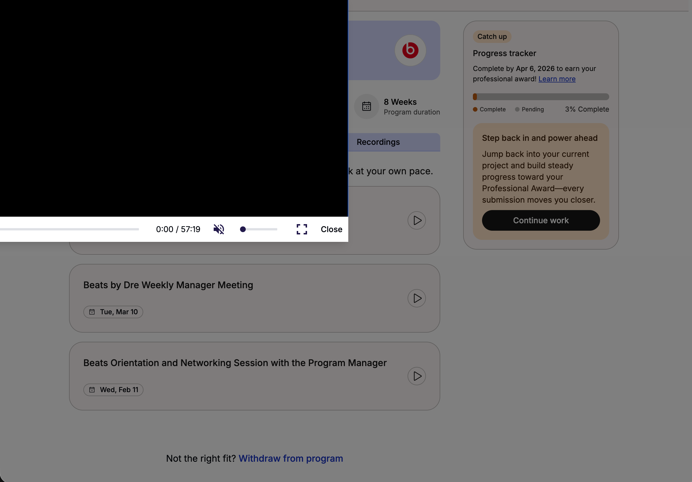
Recording Player Overlaps UI
Video Player Covers Page Content
When viewing session recordings on the program page, the video player overflows its container and covers the underlying page content. Program info, the progress tracker, and navigation all get obscured behind the player. The player lacks proper CSS containment and z-index management. For students trying to catch up on missed sessions (a critical engagement touchpoint), this is a broken experience that forces them to close the player just to navigate the page.
Recording player overflows its container, blocking program info and progress tracker
One Active Program Limit
Artificially Caps Engagement
The catalog says "You can have one active program at a time." This kills cross-pollination and limits LTV. Students who finish one externship should be able to start the next immediately, not wait. Consider a "primary + secondary" model or allow parallel enrollment in a Sprint + Externship.
Sprints Are Underutilized
Only 2 Sprints, Massive Potential
Sprint Catalog has just 2 programs (3-week, 3-5 hrs/week). This is the perfect format for the "Week 1 Aha": short enough to complete during trial, structured enough to feel real. 10x the sprint catalog and use sprints as the activation mechanic for new users. Finish a sprint, get hooked, then start a full externship.
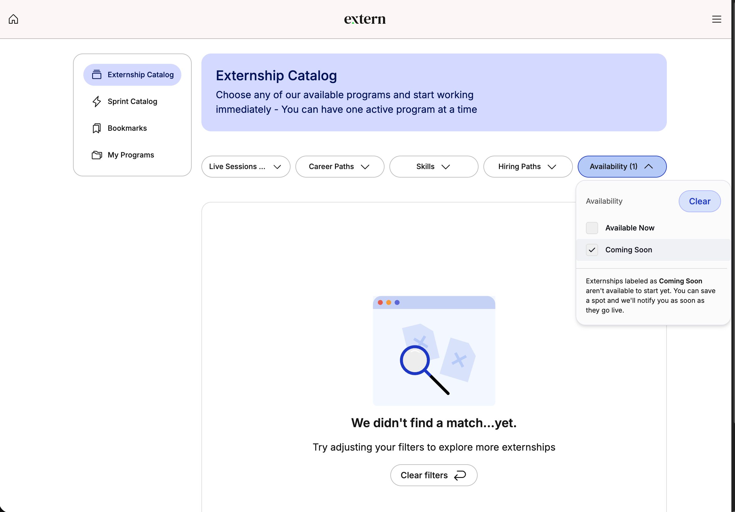
"Coming Soon" Filter Returns Nothing
Empty Pipeline Signals Stagnation
Filtering the Externship Catalog by "Coming Soon" returns zero results: "We didn't find a match...yet." This tells users there's nothing new in the pipeline. A "Coming Soon" filter that's always empty is worse than not having it at all: it signals the platform isn't growing. Either populate the pipeline with upcoming externships or remove the filter entirely. An empty future state undermines the value of a subscription.
"Coming Soon" availability filter returns no results. Nothing in the pipeline
Hiring Paths Are Buried
Best Feature, Worst Placement
"Referral Opportunity," "Internship Opportunity," and "Interview Opportunity" badges exist on some cards. This is the single most compelling value prop, and it's hidden inside filter checkboxes. Make hiring paths a top-level navigation item, a dedicated section on home, and the hero message: "These externships can lead to real jobs."
No Social or Community Layer
Cohorts, Peers, Mentors Are Invisible
There's no visible community feature: no cohort chat, no peer profiles, no mentor connections. The empty Bookmarks page just says "Let's fill it up!" with no recommendations. Every empty state is a missed chance to surface content, social proof, or peer activity ("12 students just started this externship").
No Career Portfolio or Progress
Nothing Shows What You've Built
After completing externships, there's no persistent dashboard showing skills earned, companies worked with, or career domains explored. No shareable portfolio link. No LinkedIn export. The "My Programs" page should be a living career portfolio that students are proud to share. That's what makes the subscription feel worth keeping.
Account Page: No Upsell
Subscription Section Is a Dead End
My Account shows "Active" status and next billing date, but no plan name, no price, no plan comparison, and no upgrade CTA. Monthly subscribers should see "Save 17% by switching to annual" right here. This is the highest-intent moment for upselling. The user is literally looking at their billing, and it's wasted.
Awards Page Is Unused Potential
Gamification Framework Exists but Feels Empty
The Professional Awards page promises "shareable awards that boost your resume and LinkedIn profile." That's a strong value prop. But for new users it's just another empty state. Show previews of what awards look like, display how many other students have earned them, and add a "Complete your first project to earn ___" teaser to drive engagement from Day 1.
Every Empty State Is Generic
Bookmarks, Saved Spots, Completed: All the Same
Bookmarks, Saved Spots, and Completed Programs all show the same pattern: empty box + "Browse catalog" button. Each empty state should be contextual and personalized: "Students like you bookmarked these 3 externships," "You're 40% through your first program. Here's what comes next," "Complete your externship to see your award here."
Mobile Experience Audit
I tested the app on mobile. The experience needs work.
No Mobile-Native Patterns
Desktop Squeezed, Not Redesigned
The mobile experience is a responsive squeeze, not a mobile-first design. No bottom nav bar, no swipe gestures, no pull-to-refresh. For a Gen Z audience that lives on their phone, this feels dated. A bottom tab bar (Home, Catalog, My Programs, Profile) would dramatically improve navigation.
Quick UX Wins (Week 1-2)
Fix broken Slack invite link. The #1 onboarding CTA is dead.
Delay "trial ending" email to Day 5.
Add search bar to catalog.
Surface "Hiring Path" externships prominently.
Create public pricing page.
Add annual upsell on Account page.
Personalize emails with actual program name.
11. Marketing Creative Audit
The Ad Copy Is Strong. The Creative Undermines It.
Extern's Facebook ads have the right messaging direction - authentic, relatable, problem-aware. But the video creative has production issues that erode the polish the copy earns.
Screen Recording Artifacts
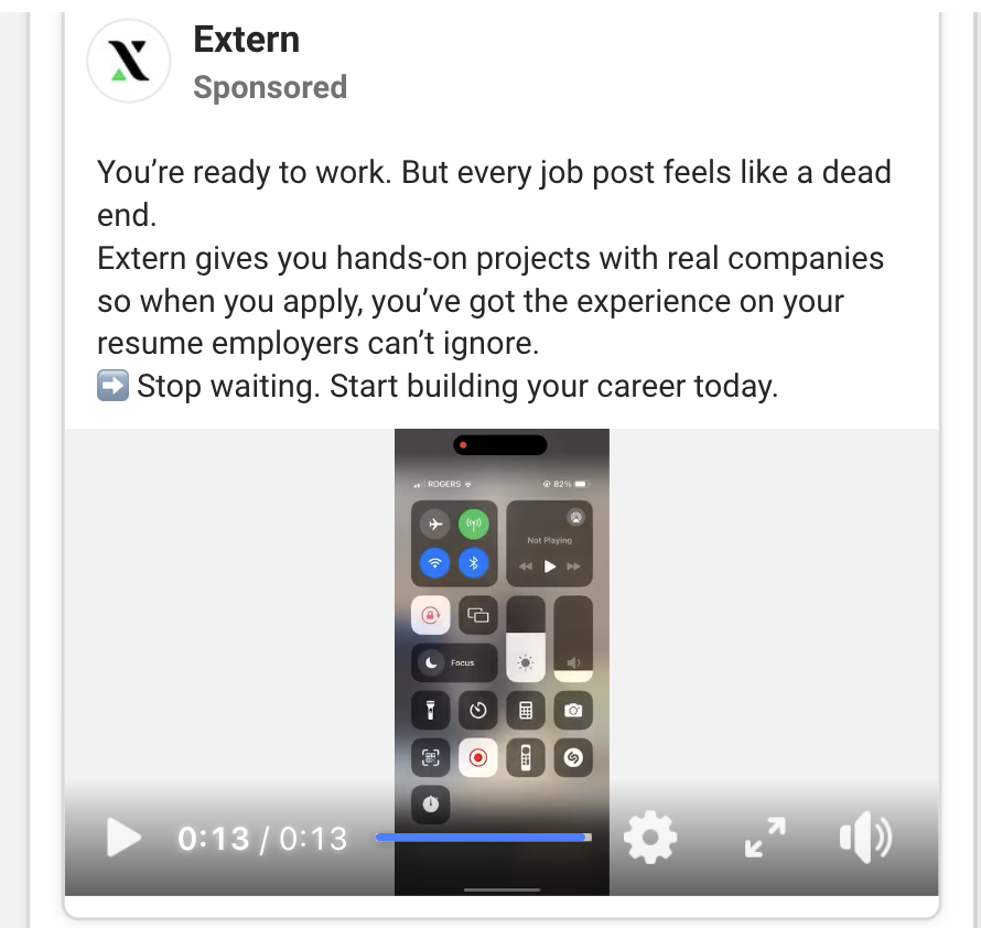
Raw Screen Captures Signal "Low Budget"
Some ad creatives appear to be raw screen recordings with visible phone UI elements, control center overlays, and notification bars left in frame. For a platform selling professional career experience, this visual roughness contradicts the brand promise. The copy says "stop waiting, start building your career" - the creative should match that energy with clean, intentional visuals. Even simple edits like cropping out system UI, adding branded frames, or using screen capture tools that hide overlays would dramatically improve perceived quality.
Ad creative shows raw screen recording with phone control overlays visible
TikTok UI Inside a Facebook Ad
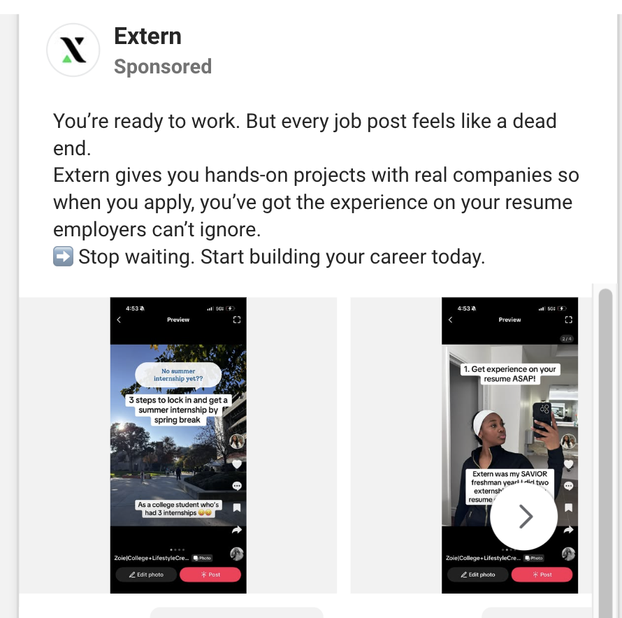
Cross-Platform Creative Looks Recycled
One of the Facebook ad creatives clearly shows TikTok's native UI - navigation bars, interaction buttons, and the full TikTok interface visible within the video. Running a TikTok screen recording as a Facebook ad signals to users that the creative wasn't made for them. It breaks the "native content" feel that high-performing paid social relies on. Each platform should get creative that feels native to that platform. Repurposing is fine - but strip the source platform's UI, re-frame the content, and adapt aspect ratios and pacing to match where it's running.
TikTok's full interface visible inside a Facebook ad placement
What's Working
The Copy & Positioning Are Right
The ad copy is genuinely good: "You're ready to work. But every job post feels like a dead end." That's a real insight about Gen Z job seekers. The problem-solution framing is clear, the tone is authentic without being corporate, and the CTA is direct. The messaging direction is strong - the creative production just needs to match the quality of the words.
Recommendations
Quick Fixes to Elevate Ad Creative
Crop all system UI (status bars, control centers, notification panels) from screen recordings.
Strip TikTok/Instagram UI when repurposing content for Facebook.
Add branded device mockup frames around app walkthroughs.
Create platform-native versions for each channel — same message, different visual treatment.
Test polished vs. raw creative: the authentic feel may actually perform, but let the data decide rather than defaulting to unedited recordings.
Net Assessment
Extern's paid social has the hardest part figured out: the messaging resonates. The gap is purely production polish. A few hours of post-production per creative batch - cropping, framing, platform-adapting - would meaningfully improve CTR and brand perception without changing the strategy at all.
12. I've Solved These Exact Problems Before
Proof Points
Every recommendation in this deck is backed by something I've actually shipped and measured.
Fixed a Broken Payment Flow, Drove 18% Sustained Growth
At a previous company, I discovered our payment funnel was leaking conversions due to technical friction: failed transactions, confusing flows, and broken edge cases. I personally dug into the data, mapped every drop-off point, and rebuilt the payment experience. The result was double-digit sustained growth. When I saw Extern's payment page resetting, I recognized the exact same pattern: revenue walking out the door through a broken checkout.
Fourth Tier Pricing → Extern's Pricing Gap
Redesigned Pricing to Match User Value, 25% Revenue Increase
At a previous company, our pricing tiers didn't map to how users actually got value. I introduced a fourth tier that filled a gap in the lineup for users who wanted more than basic but weren't ready for premium. Revenue jumped 25%. Extern has the same gap: students who want more than monthly but won't commit to annual. The quarterly plan solves this.
Onboarding Rebuild → Extern's Week 1 Aha
Rebuilt Onboarding with AI, New User Retention +40%
At a consumer platform with 50M DAUs, new users were bouncing before experiencing core value. We rebuilt the first-time experience and used AI to surface relevant content immediately. New user retention jumped 40%. Extern's trial users face the same problem: the "aha moment" comes weeks into an externship, way too late. Compressing time-to-value is the exact playbook.
Experimentation Culture → Extern's Growth Engine
Built Experimentation from Zero, 10x Test Velocity
At a previous company, the team had basically stopped experimenting. I built the infrastructure, the culture, and the willingness to kill things that don't work. We went from near-zero tests to dozens running simultaneously. Extern needs this same discipline: small bets, fast reads, and doubling down on winners. I've built this engine before.
JTBD Discovery → Understanding Student Needs
Discovered Users' Real Jobs-to-Be-Done
At a previous company, we assumed users wanted better filters and search. Through JTBD research, we discovered they actually wanted to be matched to the right people. They didn't want to search at all. We pivoted from filters to AI-powered recommendations and engagement metrics changed completely. Extern's students don't want "access to externships." They want proof they're hirable. Reframing the value prop around outcomes is the same JTBD insight.
Live Streaming 0→1 Pivot → B2B to B2C Transition
Spotted a Market Shift and Pivoted the Product
At a previous company, I saw the Chinese live-streaming market shifting toward personal, one-to-many connections. I pitched pivoting our platform in that direction, ran a pilot with influencers, and engagement doubled. We set new standards in those markets. Extern's B2B → D2C pivot requires the same instinct: reading the market, validating fast, and committing before the window closes.
Get in Touch
Need Help With Your Funnel or Growth?
I do this because I love it. If you're building a product and want a fresh set of eyes on your funnel, conversion, pricing, or retention strategy, I'd love to hear from you.